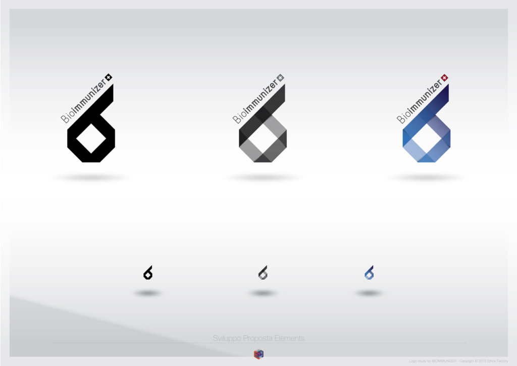
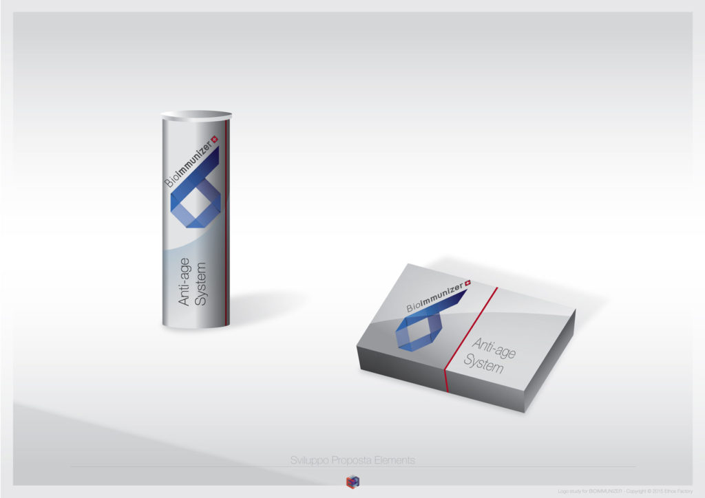
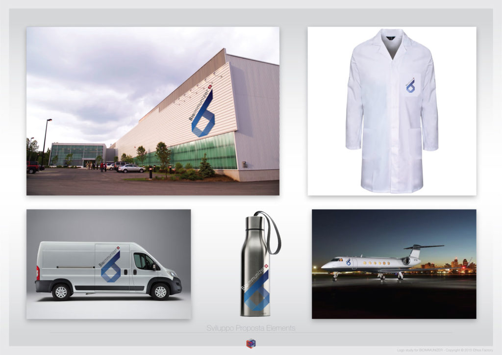
This identity study is for a Swiss-based dietary supplements company. During the development phase we narrowed the viable marks to three distinct marks, as it often happens the client choice didn’t coincide with our preference however here are both solutions. See which one is your favorite.
Briefing: To develop an identity that would convey the company’s scientific approach and solid research, also setting it apart from other competitors in the supplements segment which are often less sophisticated in their branding approach.
Objective: To create an identity that would be perceived as trustworthy as a pharmaceutical product from and established brand.
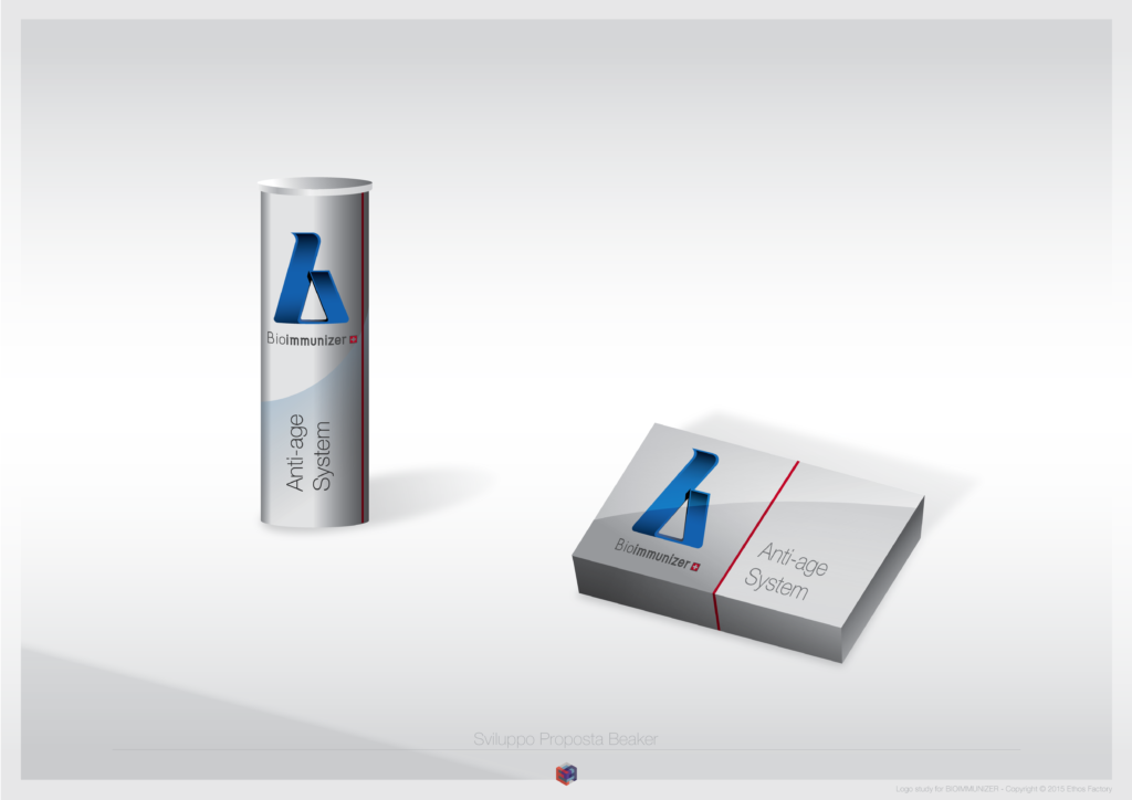
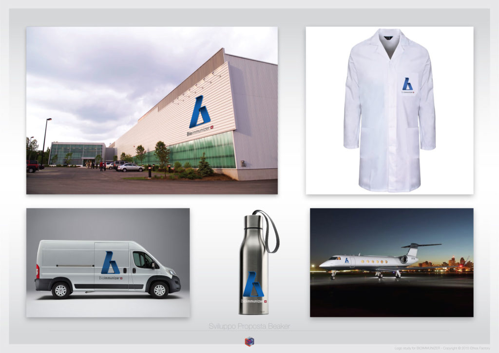
Creative line: Beaker

Creative line: Elements
This logo has such a wonderful potential when it comes to animation that I thought it would be fun to see it animated as a .GIF
